Best Color Schemes for Office Interior Design
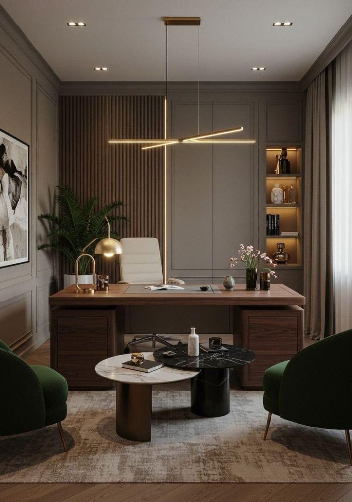
The color on your office walls does more than just look good. It affects how people feel, how focused they are and how they perceive your brand the moment they walk in. Office interior design color schemes are one of the most underrated decisions a business can make and in 2026 more companies are getting intentional about it.
Whether you are designing a corporate office, a home workspace or a creative studio, color sets the tone for everything. The wrong palette can make a space feel cold, chaotic or just off, even if the furniture and layout are great. The right one can boost productivity, support focus, and make your office feel professional without being boring.
Here are the best office color schemes to consider this year with practical design direction for each.
1. Minimal Black and White Office Color Schemes
Black and white is a classic for a reason. It is clean, high-contrast, and works across almost every industry from law firms to design studios. In 2026 the minimal black and white office is getting a slight update: warmer whites (think off-white or ivory) replacing stark bright white and matte black replacing glossy finishes.
This combination creates a professional, focused environment. It also photographs extremely well, which matters if clients visit your space or if you are showcasing your office online.
How to make it work:
- Use warm white on walls and matte black for furniture frames and fixtures
- Add texture through fabrics and materials to avoid the space feeling flat
- Introduce one natural element wood or greenery to break the monochrome
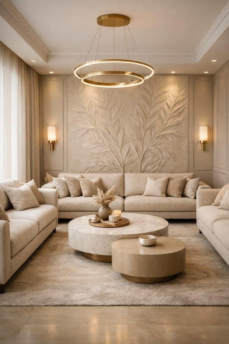
2. Neutral Beige and Earth Tone Workspaces
Earth tones have moved well beyond residential interiors. In 2026 neutral beige, warm taupe, terracotta and sand are showing up in offices that want to feel grounded and approachable without sacrificing professionalism.
This palette works especially well in open-plan offices or client-facing spaces where you want people to feel comfortable. It is not clinical, not cold and not overstimulating. Earth tones create a calm baseline that most people find easy to work in for long hours.
Pair warm beige walls with natural wood desks, linen or cotton upholstery and brass or bronze hardware. The result is a modern workspace design that feels warm and considered.
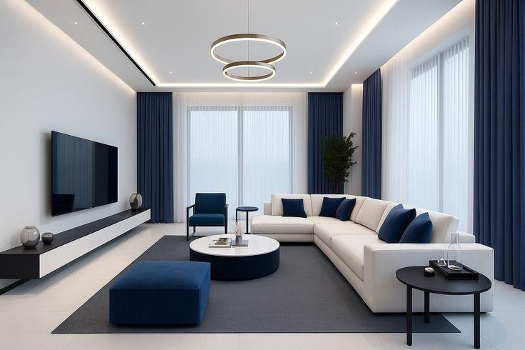
3. Blue Office Interiors for Productivity
Blue is consistently ranked as one of the most productivity-friendly colors in workplace research. It promotes focus, reduces stress and creates a sense of stability, all things you want in a professional office environment.
The key is choosing the right shade. Deep navy works well in executive offices and boardrooms, it feels authoritative without being aggressive. Soft slate blue or dusty teal works better in collaborative or open-plan spaces where you want a calm but alert atmosphere.
For corporate office interiors blue is also a smart branding choice it communicates trust and competence which is why so many financial and tech companies use it as their primary color.
Blue office pairings that work:
- Navy + warm white + natural wood
- Slate blue + light grey + chrome accents
- Dusty teal + off-white + rattan or woven textures
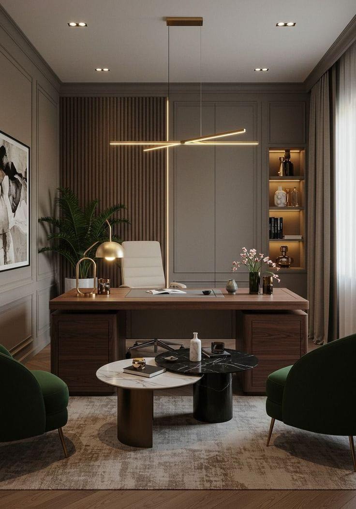
4. Luxury Dark Office Interior Themes
Dark offices used to feel risky. Now they are one of the most sought-after looks in luxury office design. Done well a dark interior feels sophisticated, focused and premium especially for private offices, legal firms, creative agencies and executive suites.
Deep charcoal, forest green, burgundy and slate are all strong options for a dark office palette. The trick is to balance the depth of the walls with good lighting both natural and artificial. Recessed lighting, table lamps and backlit shelving all help dark interiors feel dramatic without feeling oppressive.
This style pairs naturally with rich materials, leather seating, dark timber, brass fixtures and stone surfaces. If you want your office to communicate that you are serious and established a luxury dark interior delivers that without much effort.
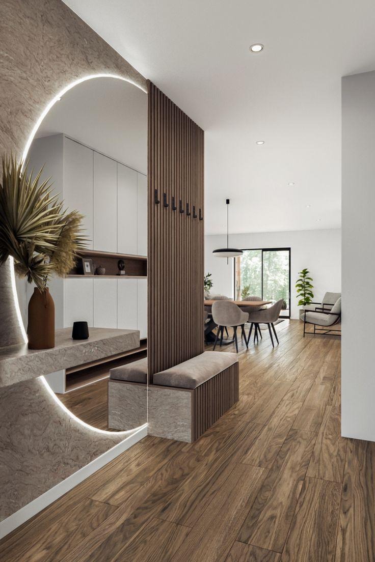
5. Modern Green and Natural Office Designs
Green is having a real moment in office interiors and not just as an accent. In 2026, sage green, olive, and muted forest green are being used as primary wall colors in modern workspaces that want to feel both fresh and grounded.
Green connects to nature which has a measurable positive effect on focus and stress levels. Biophilic design designing spaces that feel connected to the natural world is a growing priority in office interiors, and green is the easiest way to bring that quality in without a major redesign.
You can combine green walls with indoor plants, natural light, and wood tones for a full biophilic effect. Or you can use green more minimally as an accent wall or in soft furnishings to add warmth to an otherwise neutral space.
6. Creative Office Color Combinations for Startups
Startups and creative businesses have more freedom with color, and they should use it. A bold or unexpected color combination can reflect brand personality, energize the team, and make the office a place people actually want to spend time in.
That said, bold does not have to mean chaotic. The most successful creative office color combinations are still rooted in balance. Think one strong base color a deep terracotta, a burnt orange, a cobalt blue paired with neutrals and white space so it does not overwhelm.
Creative combinations worth trying:
- Burnt orange + warm white + black metal fixtures
- Cobalt blue + soft yellow + natural wood
- Dusty rose + charcoal + brass works well for creative or beauty-adjacent businesses
- Deep purple + light grey + white modern, editorial feel
Design Tips for Choosing Your Office Color Scheme
Use natural lighting effectively.
Always test paint colors in your actual space before committing. Natural light changes how colors read throughout the day.
Match colors with brand identity.
Your office interior is an extension of your brand. If your brand colors are bold, bring them in subtly through accents rather than full walls.
Avoid overly bright or distracting colors.
High-saturation colors like neon yellow or bright red can cause fatigue over long work sessions. Use them sparingly as accents only.
Balance neutral and accent tones.
A good rule is 60-30-10 means 60% dominant neutral, 30% secondary tone, 10% accent color. This keeps the space cohesive without being flat.
Frequently Asked Questions
Q: What are the best colors for office interiors?
A: Neutrals like white, beige and grey keep spaces clean and focused. Blue suits productivity-driven offices while green works well for creative or wellness-oriented environments.
Q: Which office colors improve productivity?
A: Blue and green are the strongest options; both reduce stress and support focus. Avoid high-saturation or clashing colors in spaces where deep work happens.
Q: Are dark office interiors modern?
A: Yes, when paired with layered lighting and quality materials, dark interiors are one of the most sophisticated looks in professional design right now.
Q: How do I choose an office color scheme?
A: Start with your brand identity and how the space will be used. Factor in lighting, room size, and the mood you want, then build your palette from there.
Final Thoughts
Color is one of the first things people notice when they walk into an office and one of the last things most businesses plan properly. The best office interiors in 2026 are deliberate, not just functional. Every color choice quietly supports how people work, feel, and perceive the brand.
Start with your space’s purpose, match a palette to it, and commit to it fully.
A well-colored office is not just aesthetic: it is functional design that works quietly in the background every single day.